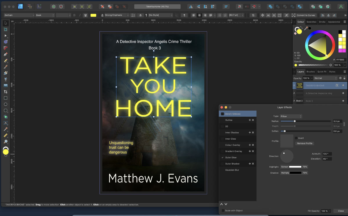
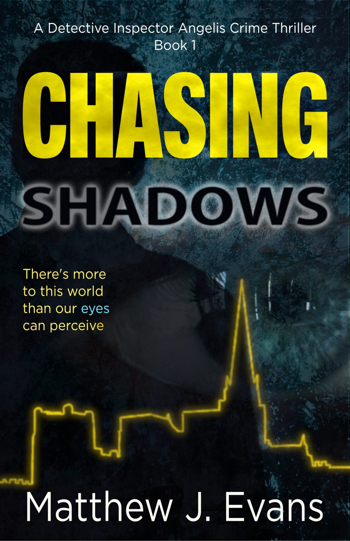
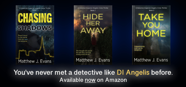
I designed most of my book covers myself, with the help and feedback of my daughters. Book covers are terribly important. People definitely judge a book by its cover. If it looks awful, no one’s going to give it a second thought. One of the golden rules I was taught as an independent author was to get a professional designer to design your book cover. I get it, I really do. However, like most other authors, I’m not rich. Typically, designers charge £25 per hour plus, and you could end up spending £250 to £1000 on a cover. I don’t have that kind of money. I have some graphic design experience, so I had a go myself. My first cover for Chasing Shadows was of a yew tree that I know in Kingley Vale, near Chichester. It’s a wonderful, scraggy old man with a flaky beard of roots. This forest (again, no spoilers) appears in my books because it is special to DI Angelis.
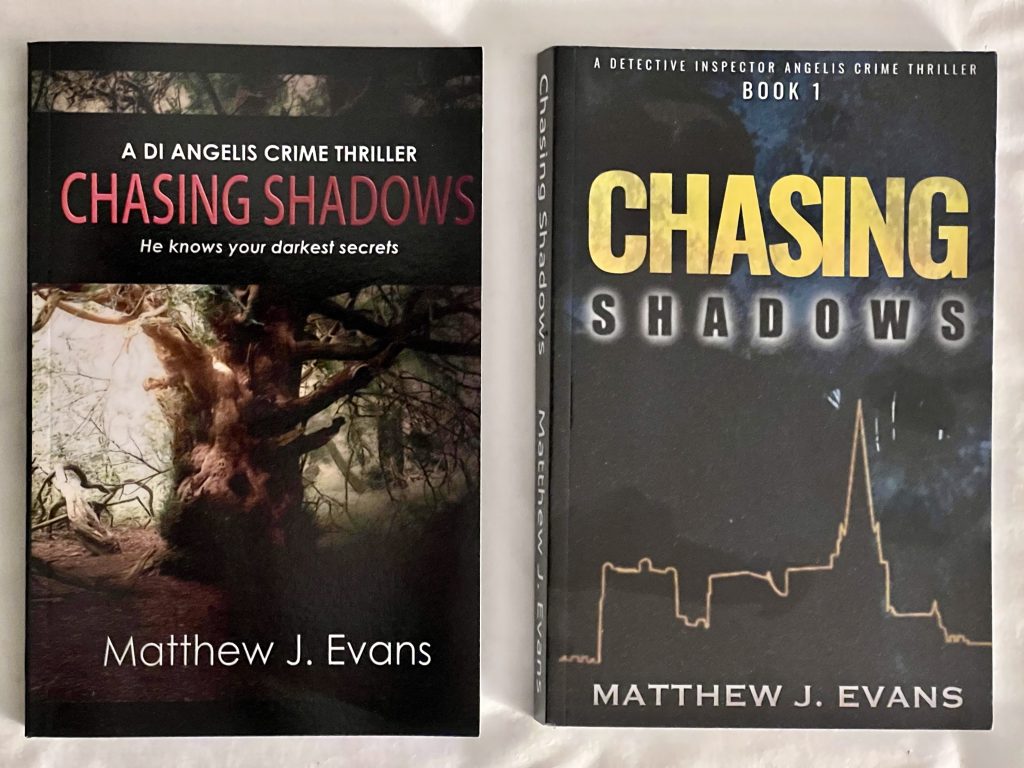
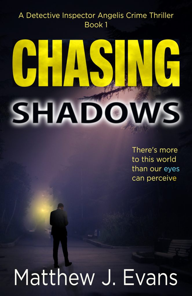
I launched with this cover, and it was okay. Okay, sort of. And this is where the advice about going to professional cover designers is correct. I wasn’t totally happy with the design. It was then that I asked my daughter Caitlin and her now-husband Jared—he’s a talented magician, of all things—to help me. Caitlin is artistically talented. Both my daughters are. They came up with the second iteration of the ‘Chasing Shadows’ cover, which is very similar to what it is now. This features an eye, trees in the background, a shadowy figure, and a yellow outline of Chichester Cathedral. Caitlin’s idea was clever because it also looks like a heart monitor trace. You’ll have to read the book to know why that’s relevant.

I stuck with this design for several months. I was concerned that people wouldn’t see what it was. So then came two other attempts, again designed by me. One depicts a special seat in Brandy Hole Copse, as seen in the story, and another depicts a man in a dark suit under a streetlight in a park. I used to be indecisive, but now I still am. After a lot of thought, I have finally, and I mean finally, gone back to Caitlin and Jared’s design, with a few modifications, mainly text, to match the other books in the series. This is the joy of self-publishing. You can change the design of your covers as many times as you like. Of course, the actual story remains the same. The only thing I would change in the inside text is typos and layout, e.g., text formatting.
 |
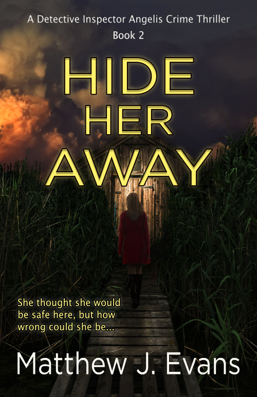
I designed the ‘Hide Her Away’ cover, and it has basically stayed the same. There has been a slight change by making some of the colours pop and adding a hook line, but nothing else. I’ve been happy with the response to that cover.
 |
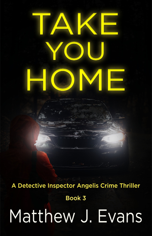 |
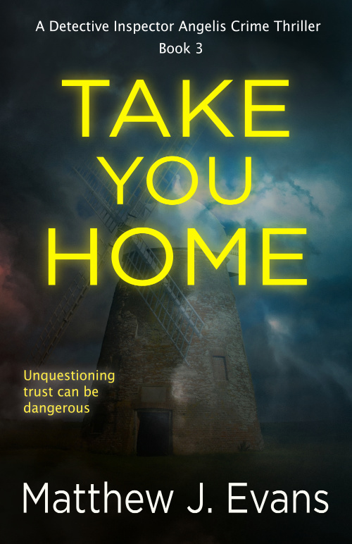
‘Take You Home’ has had two iterations of covers. The first one was a woman standing in front of car headlights in the dark. The second is of a dreamy-looking windmill with an added hook line. The reason for this change was that I found the stock photo of the car I used appearing elsewhere on the internet. I decided that this is the last time I’m going to use stock photos on my covers. I will now only use my own. The photo of the windmill is one I took over ten years ago. It’s the Halnaker Windmill before it was restored. This windmill appears in the book and is a key location.
 |
I think my cover designing skills are improving, and I have no doubt that a professional book cover designer would do a much better job. When I get some decent sales, that and a professional editor are the first things I’ll be paying for.
 |
Update August 2023
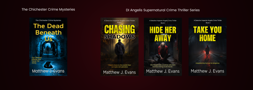
After more thought and analysis of the figures, I still didn’t think the first cover was grabbing enough traction with people. Possibly a little vague? So once again I redesigned the front covers for all three books. I had to try and make the fonts look the same. My latest book, the Dead Beneath Us is a different series, so I wanted it to have a different feel all together. So, these are now the current covers for my series of books.